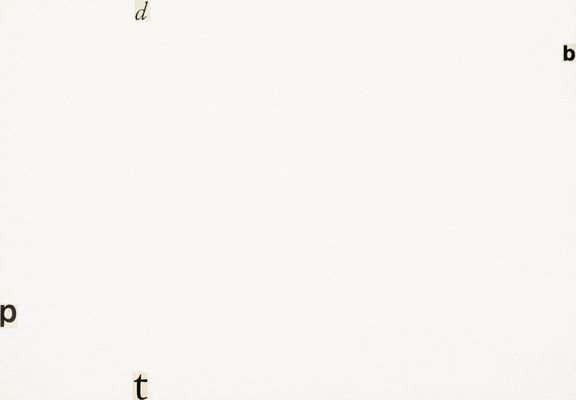
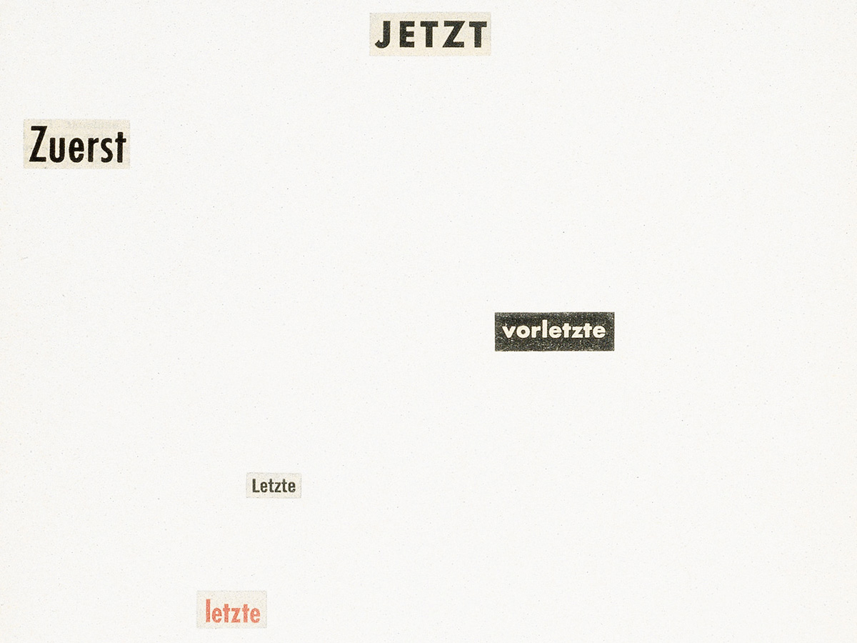
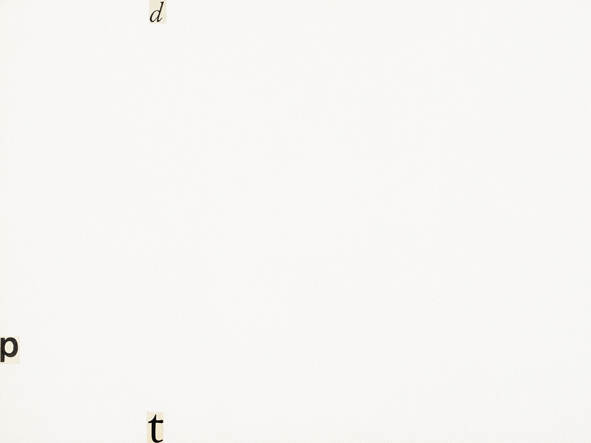
Words, cut out from newspapers, mounted on paper
21.9 x 31.3 cm and 31.5 x 22 cm, framed 70 x 50 cm each
(GF0002082.00.0-1999, GF0002083.00.0-1999)
Originally Rühm’s typocollages were called “Designs in Word and Sound.” Here, as in concrete art, concrete poetry, and concrete music, seriality and the isolation of colors or words are fundamental strategies. Rühm’s interest in reducing things to essentials is particularly apparent in the collages, which show great affinity with Mondrian’s paintings. Tension of various kinds is generated by different combinations of image, color, and text. The choice of color, usually a primary color (red, blue, yellow), white and black, yields symbolic significance that influences one of the added words. The connotation of the verb “to touch,” for example, changes depending on whether it is combined with red or pink. Ideas about the universe are also important to Rühm. Thus, the choice of a term such as “floating” is related to a state of weightlessness. (Nadja Wiesener)